Mapping Animals in US Agriculture
This interactive map lets you investigate where animals are in the United States.
04 September 2018
This post is a continuation of my writing on rise of factory farming of hogs and cattle, the waste this industry creates, and the burdens faced by people impacted by it. This map lets people explore some data for themselves.
The 2012 USDA Census of Agriculture contains county-level livestock head counts for several different types of animals. This census also records how much each type of animal weighs. US counties are extremely varied in size, and so are their animals. In 2012 the average American chicken weighed 6 pounds while the average cow weighed 1249.
In each county, the head count of each animal is multiplied by that animal’s average weight, creating an estimate for the total amount of pounds of that animal in that county. Cattle, hogs, chickens, goats, ducks, and turkeys are counted in this map. All county animal weight totals are summed, and this total weight is divided to yield an estimate for pounds of animal per square mile for each county. This number is scaled by percentile and used to color code the map:
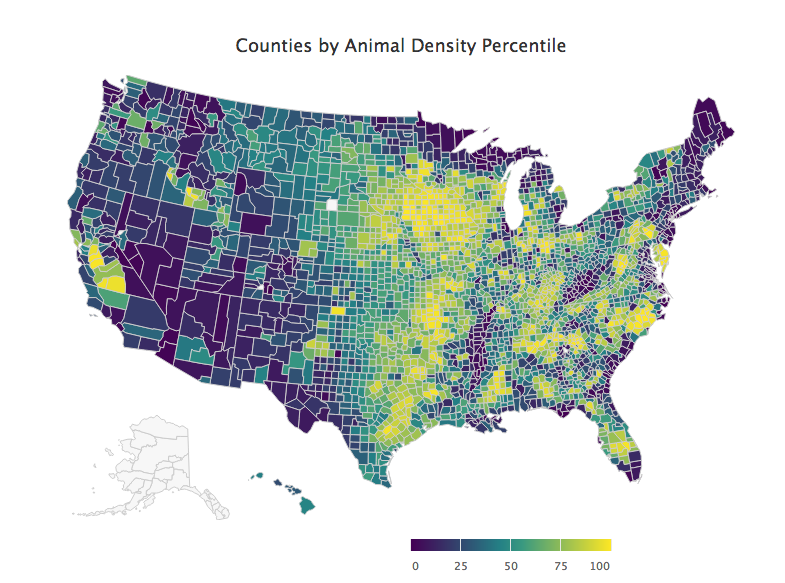
Data from 2012 USDA Census of Agriculture. Yellow counties have the greatest animal mass per area, while the purple counties have the least.
An interactive version of this map is available (note: this loads slowly and displays poorly on mobile). There are some missing counties, and it seems that a technical issue left out data on Alaska entirely. On the interactive map, hovering over an individual county will show its their livestock counts:
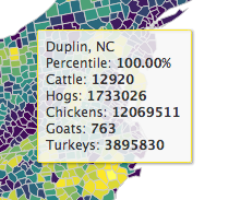
It was not surprising to see Duplin, NC rank at the top of this metric, because Duplin’s hog industry is well known for reckless pollution that harms the health of the disproportionately poor, non-white county. Duplin was also the focus of a previous article and a visualization I posted that discusses the strong presence of animal agriculture pollution in low income communities.
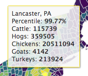
This data can also be revealing about random counties as well. For instance, Lancaster, PA had over 20 million chickens in 2012. It’s not surprising that this county has had its own issues with waste pollution as well.
All code used to process data and create graphs is on GitHub. Content crossposted on Steemit.
04 september 2018. filed under agriculture, statistics, and animals.